TEAM
DELIVERABLES
Katie Lowenstein
Marisa Russell
Logo
Booklet
Press Kit
Visual Design
Creative Design
Behind Koru
Koru is a new organization that aims to spread awareness of the “A” in STEAM: science, technology, engineering, art, and math. They are a non-profit organization with hopes of having an international audience to teach students of all ages, elemetary up to graduate, as well as companies, of the importance of design. Koru hopes to highlight the role of design in relationship to the other letters of “STEAM” and show how it plays a role in successful companies.
ROLE
Designer
Researcher
DURATION
Four Months
TOOLS
Adobe Creative Suite, Illustrator, Photoshop, InDesign,
CLIENT
Non-Profit Organization
PROBLEM
This project was creative research to offer departmentally for a non-profit design education program. The problem at hand was that this organization is in early development stages, and therefore, needed help defining the company before entering into the design process.
SOLUTION
We had four months for this design, which allowed us to take a deep dive into what aspect of design they wanted to promote.Through various client meetings we were able to narrow down the concept of the organization, this led us to design a brand based on how the world around us, inspires designers to succeed. This in return, gave us more inspiration to appropriately design for the client and develop the brand as a whole.
RESPONSIBILITIES
Although there were three of us on the team, we all had to submit individual branding assets as research for the department. We worked as a team in the beginning of the process, in order to determine the company name, the mission, and other basics for the company. Throughout the rest of the four months, we stayed as a team to discuss ideas, recieve feedback, and double check deadlines. In the end, we were each responsible for developing our own logos, press kits, physical brand guides, and a physical process book.
RESEARCH & CLIENT MEETINGS
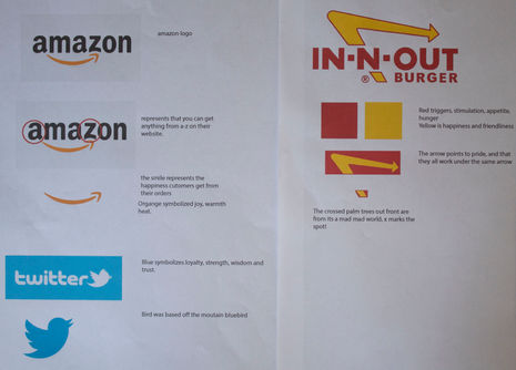
After the first client meeting, it was evident that the client wanted to show through their brand, the import role that graphic designers play. They wanted a brand that showed the “art of living”. We researched icon, idex, symbols, and meta symbols to understand the type of images that could make up a logo. Next, we did branding and identity studies of various successful companies to understand the best practices that emerge that can serve as a foundation for design approaches and solutions for the anatomy of successful logos and branding. We identified the audience and goal of the brand, and with these identified, we were able to begin the process of desiging the logo.

DEFINING THE GOAL
After research and client meetings, we were able to determine the goal of the logo we were in charge of designing:
Design a logo that is modern, highlights designers capabilities, and is able to be recognized by an international audience of all ages.
LOGO DEVELOPMENT
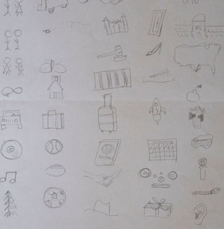
This process started with many sketches. We began sketching out initial icons that represent design to us, inspired by what “the art of living” means to each designer. We used the goal and the icons that represented design, and tried to combine object with meaning, to create our initial logos. I started with an idea of nature, and I used marker paper and sharpie to create over 1,000 drafts.
PEER TESTING
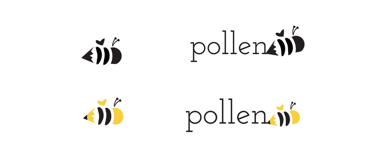
After narrowing down my process, and fixating on a few, I brought them into the computer to refine them. I was stuck on an idea of a sense of nature and a pencil, or a brain and a leaf, to show how designers are inspired by the world around them. We presented our ideas to our peers, and they chose my last logo as my strongest.
FIRST ATTEMPT
I narrowed my ideas down further, and added type. After seeing my type options, I decided on a name, and my type. I began designing assets around this logo to decide if it was the right direction for me.
REDESIGN
After looking back at the goal we had made for the company and speaking with our
director, our team decided to redesign. I didn’t think my company name or design was the best design for the goal we established, and my teammates felt the same about their work. We went back to the drawingboard and came up with Koru. It is a Maori word meaning “swirl” or “spiral”, inspired by the natural spiral of plants.
Visual System
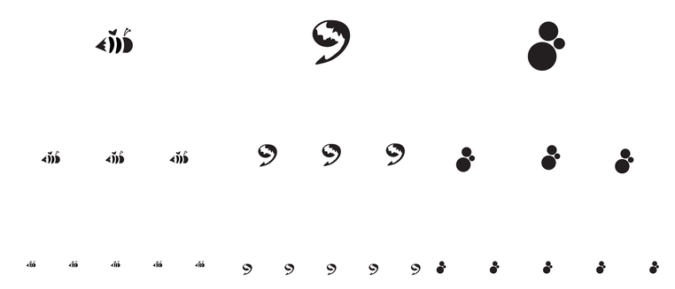
Here is the final outcome. I also designed a sub brand, and that logo and design is included.


COHESIVE
After completing all of the details and assets, it was time to put together the Brand Guide. I drew out layouts to play with them visually, loaded them into InDesign, and began the process. After finishing the document, I printed it, used a perfect bind to bind it, and used book board and cloth to make the hard covers.
REFLECTION
From the beginning, we were told about this vague initiative, which is intimidating to start such a detailed process about a company that we knew practically nothing about. Going through this process from start to finish, for the first time, really taught me a lot. It taught me a lot about logo legibility and readability, logo structure, color, type, and everything in between. It’s one thing to learn about all these elements individually, but using them together to create branding for a company was a great, educational, experience.
The biggest lesson I learned was to fail often, and fail hard. It’s easy to be timid thinking about failing, that someone might not like your logo, or design, but the faster you fail, the faster you can recover. I designed a logo that I wasn’t in love with, and that only led me to designing a brand guide that I am extremely proud of.


